Posts

Showing posts from March, 2018

Table of Contents

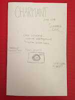
Today I have been working on the table of contents. So far the structure of the table of contents look really cool. The reason why I like the structure is because it's different from all the table of contents I've seen in the magazines. The structure itself is just what I pictured in my brain. The only issue is that I don't know if the font sizes are readable for the audience to read. I also don't know if I should include all the pictures in the table of contents and instead just add like two pictures that match the two articles out of five articles mentioned in the table of contents. I just don't know if the size is proportional to the magazine because on the computer is different than the actual print size magazine. Even if I include the two pictures in the table of contents it will still look boring and dull. I feel like the table of contents is missing color or graphic design on the top right hand corner.  I don't know. If i talk to my partner when we get

Magazine Update

I have finally COMPLETED my cover page. I am very satisfied with the outcome. On my last blog post I had stated that I wasn't able to find any solutions with the subheadings on the side. The issue was that I had the subheadings on both sides of the magazines. In my opinion, I felt like the subheadings was distracting to the cover photo. It took me like an hour to finally come up with a solution that I believe would catch the audience's attention. The subheadings isn't distracting the audience from the cover image. It's also clear for the audience to read and understand the text. After I finished working on the cover page, the next page I started creating is the table of contents. I tried searching for table of contents template (thinking that Canva already had the template) but, there was none that matched what I was looking for. I knew right after that I had to literally create my own template. At first, I was really worried that creating a whole new template would b

Cover Page Dilemma

Image
I have finally started working on the cover page on Canva. I have been having difficulty in organizing the subtexts on the side of the cover page. Based on the fashion magazines on google, they were all on one font with different sizes with three different colors. I don't really know what to do because the background I chose for the cover page doesn't allow me to have a wide color scheme. The only color that is visible on display is White. Black and Turquoise can also be seen but only on certain parts on the background photo but it doesn't seem to blend very well. My cousin and I have been finding alternatives so that the color scheme will blend well, but so far we have no solution. I am starting to get really stressed. I feel like I'm running behind with this project since it's due in like three weeks and I have only been working on just the cover page and I still have to work on the table of contents and the two page spread. It turns out that the the inspirat

Filters

Image
For my cover photo, I want my photo to have a filter that makes the fashion pop out even more. I also want to add a retro feeling. Even though my fashion isn't retro, I still want to give the photo a pinch of character. Here are the photos of different filters: Original photo Dodger Warm color Twilight I used PicsArt to put filters on the cover photo. Picsart is an image editing, collage, and drawing application and a social network.  PicsArt enables users to take and edit pictures, draw with layers, and share their images with the PicsArt community and on other networks like  Facebook  and  Instagram . The app is available on  iOS ,  Android , and  Windows  mobile devices.  I like all three filters but I think I want to choose the Dodger filter because I like how it brightens the background and highlights the outfits of the model. Also, the dodger filter adds character to the photo. I am very glad that I didn't have to use a fancy digital camera to make my

Potential VS. Original photo

Image
Ok, so before I want to move on with my magazine, I want to be sure that I choosing the right photo for the cover. I went back to my camera roll to see if there was another potential cover photo for my magazine. And I did find something, I just don't know if it's right. So I tried putting the potential photo in the actual magazine, and I have come to the conclusion that the original photo is the right call.   Potential photo Original photo The reason why I decided to go with the original photo is because I want the audience to see the emotion or facial expressions of the model. Even though the potential photo does have a nice sun glare on the right side of the photo, it doesn't really show on the magazine because it is going to be covered by the texts on the side. I also believe that the way the model is standing, makes a better cover picture. Before I continue with my magazine, I still have one more step to go. Read my next blog page, if you want to know what t

Start of Magazine

Image
This is the first day of many days in creating the actual magazine. I began looking at templates that my partner and I agreed on and then out of those templates, we chose two. We didn't know what template to choose, so we decided to add a picture I took yesterday of my model in the cover page, to see what would look better. Using Canva is a little frustrating, but I think I am getting the hang of it. The original idea I had with the cover page was just to have a white background and have the model in the center, just like the inspiration cover page I posted two weeks ago on my blog. But as I added the photo to the cover page on Canva, my partner and I agreed that maybe we should keep the background of the photo cause it looks good with it. But if I keep the background of the photo, then in a way it changes the color palette I had originally thought of. Right now, I'm in a dilemma because I want to put turquoise blue color as my text but it is not very readable for the audienc

Schedule

Image
I wasn't able to find anybody with a digital camera, which is alright cause I think using my phone will work just fine. Plus, photoshop can possibly make my pictures look even sharper. There are many solution to make the pictures sharper, which is why I am not worried. However, I am worried about the taking of the actual photos tomorrow. I hope the weather is in my favor tomorrow. Last week was when I was supposed to take my photos. I was all ready to do everything, but then it rained and it didn't raining until it was dark. Which is why I learned my lesson that maybe sunsets was going to be more difficult to take pictures of. And with that conclusion, I decided that tomorrow I was going to Las Olas super early in the morning and take my pictures there with the model. Of course, it is going to be very difficult to get out of bed on the weekend, but it is the only way to take my pictures where there will be a beautiful scenery and no crowds in the background. Wish me luck!

Class Feedback

In class today, my teacher arranged the class in 5 groups so that each person can present their project in each group and receive feedback from the people. It is a great opportunity to clear the air if you have doubts about anything in the project that you question. It also helps you know what thing to change to make the project better. It gives the author or director a better perspective of the audience's view of the project. Based on my classmates' feedback, they all said that the actual project was good. There was just minor things that would make my project better. For example, they said that the right side of the page is basic. That the layout should be more interesting, like maybe put the pictures and text in different sides so that way it will create some sort of pattern. Also, have the pictures in different sizes so they're not all the same. The last advice they gave me is that if I want my pictures to be similar as the pictures in my blog post called Planning Par

Cover/Table of Contents Page

Image
Today, my partner and I planned our cover page and table of contents. Because we are doing the magazine together, even though we are doing totally different issues, we wanted the cover page and the table of contents to be somewhat similar. At least the layout will be similar, the color palette will be totally different. We decided that the design of the cover page will be similar as the inspiration I had on my previous blog called planning process. The reason why we decided to go along with the same type of layout is because we want our magazine to look very fashionable. By having the heading at the very top and the article names on the right and left side. And with the background being white, it will make the headlines pop out, but not enough that it will pull the focus of the main photo.  When my partner and I started planning the table of contents, we automatically knew that we wanted it to be different and unique. A table of contents that the audience hasn't seen or ha

Magazine Layout

Image
Today I have made some progress in designing the two-page spread of my summer issue. I was very conflicted on the type of layout since in my 4th post I said that there would only be five outfits and out of those five outfits, I would choose like three. Well it turns out that the type of layout that I wanted needed more than three outfits. The reason why there needs to be exactly five outfits featured in my magazine is because I need to fill in space of the two page spread. Another conflict that I faced when designing my two page spread is coming up with the name of my article. I didn't know if I should say "Beach Chic" or "Summer Chic". I decided to go with "Summer Chic" because the clothes that will be featured in the magazine isn't just worn for the beach, you can wear it anywhere, anytime, and anyplace. I don't want the audience to think it is only beach clothes. I haven't yet designed the table of contents or the cover page beca

Research Part 2

Today I was researching ideas on how I was going to incorporate the "text making a shape" in the two page spread while also having a paragraph form list. It turns out that it makes the article too messy and can make the audience confused on how to read it which can make them disinterested. So I have come to the conclusion that the "text making a shape"will be eliminated from the article, and I will just use the paragraph form list technique. I also have come to the conclusion that I will not add another two page spread of just pictures.The reason why I will not include another two page spread is because in all the fashion magazines, most of their two page spread consists of two pictures that take the whole page. I, however, have one model that will be wearing five different outfits. In other words, I have five different pictures which would be featured in the two page spread that includes descriptions.  Planning the layout wasn't the only thing I was thinki

Planning Part 2

Image
Not only do I have to plan the layout for the magazine but I also have to plan the photos I will be taking. I have always liked fashion, but it doesn't mean I know about the fashion world, like what's trending or if its "so last season". Anyways I chose a model that not only is she photogenic but also a big fashionista. She will guide me into the right direction when it comes to the perfect summer looks. I have decided that there will be 5 outfits that I will take a picture of. And then out of those five I will choose like 3 to write about. Maybe in the future I will change my idea about the outfits, depending how successful the photo shoot comes out. I do know for sure that I don't want pictures of rompers and bathing suits in my issue. I feel like to many summer magazines have the same thing, all of them show girls wearing their rompers and bathing suits. In my opinion, summer looks don't just consist those two outfits. The website at the bottom gave me so

Planning Process

Image
When researching fashion magazines, I realized that most magazines don't really have that many actual articles. Most of their two page spreads are photos of the models and their fashion. Which then gave Valeria and I an idea. In addition of the two page spread that will have writing, we will include another two page spread but with photos. When I first started to plan the magazine, my partner and I knew that we had to come up with our own name for the magazine. We wanted our magazine to be special, something that we could come up rather than make a magazine that was similar to other fashion magazines. It was not easy finding the perfect name. We went on google translate and just converted english words into exotic languages like italian, french, portugese, etc. But most of those words were already taken in magazines. Then my friend Jose came up with the perfect words "Charmant." Valeria and I knew that it was perfect! Once we knew the magazine name, we started researc

Fashion Research

Image
It was hard choosing the right fashion magazine that best suited with the theme I chose. There were so many options like Elle, Vogue, Marie Claire, Glamour, Cosmopolitan, etc. But I was really interested in the fashion magazine called 1968. It's somewhat of a new fashion magazine that was created a few years ago. The photos in the magazine is what makes the magazine so legendary. It is also my favorite component about the magazine. The issues of the magazine come out only in seasons. This summer issue caught my eye when I first saw it. This magazine has some vintage clothing as well as trendy clothing which goes perfectly with the idea of my partner and I's magazine. My partner is doing her magazine on vintage clothing and how clothing is resurfacing in the 21st century. And I am writing about summer clothing and tips for hot summer clothes. This issue gave me an idea to take pictures of a girl wearing her summer clothes at the beach since the beach is the perfect represent