Planning Process
When researching fashion magazines, I realized that most magazines don't really have that many actual articles. Most of their two page spreads are photos of the models and their fashion. Which then gave Valeria and I an idea. In addition of the two page spread that will have writing, we will include another two page spread but with photos.
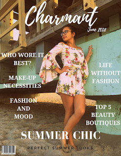
When I first started to plan the magazine, my partner and I knew that we had to come up with our own name for the magazine. We wanted our magazine to be special, something that we could come up rather than make a magazine that was similar to other fashion magazines. It was not easy finding the perfect name. We went on google translate and just converted english words into exotic languages like italian, french, portugese, etc. But most of those words were already taken in magazines. Then my friend Jose came up with the perfect words "Charmant." Valeria and I knew that it was perfect!
Once we knew the magazine name, we started researching layouts and color palettes for our magazines. Because my two page spread is going to have a list format, I knew it was going to be difficult finding a layout. After researching a lot of magazines, I have found the right layout that would be perfect to make a list as well as add photos that correspond with the list. Click on the link on the bottom to see the perfect layout and turn to page 40-41 for the two page spread.

Once I had the layout idea, now it was time to choose the color palette for the magazine. Since my theme of the magazine is "beachy" to represent summer, I knew the colors had to be similar. But my brain was overwhelmed on the cover idea. So, i searched on google for color palette ideas, and I saw the perfect example of the colors I wanted for the magazine. This magazine was the inspiration of my fashion magazine summer issue cover. I love how the black and aqua blue pop in the white background. When I was looking for more ideas in the magazine, I saw that in one of the articles that text made a shape, and in the middle of the shape there was a quote. I want to try to do that in the two page spread as well. Although, I don't think it will work out, but I still will like to try. Click on the second link on the bottom to see example on page 42-43.
1. https://issuu.com/1968_magazine/docs/issue_13_af8e16c6d72320
2. https://issuu.com/modmagazine/docs/mod-jul_aug2015-issuu_80fbc162997e51
When I first started to plan the magazine, my partner and I knew that we had to come up with our own name for the magazine. We wanted our magazine to be special, something that we could come up rather than make a magazine that was similar to other fashion magazines. It was not easy finding the perfect name. We went on google translate and just converted english words into exotic languages like italian, french, portugese, etc. But most of those words were already taken in magazines. Then my friend Jose came up with the perfect words "Charmant." Valeria and I knew that it was perfect!
Once we knew the magazine name, we started researching layouts and color palettes for our magazines. Because my two page spread is going to have a list format, I knew it was going to be difficult finding a layout. After researching a lot of magazines, I have found the right layout that would be perfect to make a list as well as add photos that correspond with the list. Click on the link on the bottom to see the perfect layout and turn to page 40-41 for the two page spread.
Once I had the layout idea, now it was time to choose the color palette for the magazine. Since my theme of the magazine is "beachy" to represent summer, I knew the colors had to be similar. But my brain was overwhelmed on the cover idea. So, i searched on google for color palette ideas, and I saw the perfect example of the colors I wanted for the magazine. This magazine was the inspiration of my fashion magazine summer issue cover. I love how the black and aqua blue pop in the white background. When I was looking for more ideas in the magazine, I saw that in one of the articles that text made a shape, and in the middle of the shape there was a quote. I want to try to do that in the two page spread as well. Although, I don't think it will work out, but I still will like to try. Click on the second link on the bottom to see example on page 42-43.
1. https://issuu.com/1968_magazine/docs/issue_13_af8e16c6d72320
2. https://issuu.com/modmagazine/docs/mod-jul_aug2015-issuu_80fbc162997e51
Comments
Post a Comment