Posts

Summer Chic CCR

https://youtu.be/-F9hiB6hsc8

The End

I have finally completed my online fashion magazine. I am very happy with the way everything turned out. At first, I was nervous that I wasn't going to finish in time, or that project was going to look rushed, but everything turned out perfect. I was actually more nervous about my two page spread cause I thought that my text was going to be bad and short, since I'm not that good of a writer. Anyways, with the help of some of my friends, I got feedback and reassurance that everything was right.  Now, all I have to do is do my CCR. There is a lot to do with my CCR, but with time and dedication, I know I can finish it.
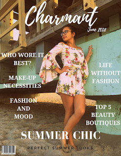
Classmates feedback

Today, I got feedback from my classmates about the project. They liked it. They didn't really say much other than that adding one more articles to the cover page and table of contents is ideal to make the cover page look more balanced. I also just found out that I had to put a bar code on my magazine, which I'm glad they told me or else I wouldn't have found out and could've gotten points off. I used https://barcode.tec-it.com/en to create a bar code and put it on my magazine. I didn't have much space to put the bar code. Usually bar codes are on the lower left corner of a magazine, but that space was taken by my article title Summer Chic. Anyways, a classmate of mine helped me position it correctly on my magazine, so that it wasn't too distracting, but enough to be seen by the audience. Overall, I think my project is looking good. I changed the color of my table of contents from light brown to like a blush pink. How I got to that color is quite interesting.

Continuation of yesterday's work

Image
For the table of contents I added more things. I put the description under the title of the articles because usually in magazine table of contents, they add descriptions of what the article is about so that the audience has an idea on what they are about to read. It also gives it an overview to see if the audience is interested in reading it. Then I added page numbers under the description so that the audience can see what page number the articles are at in case they want to read it. I decided to add one more picture to the table of contents so it isn't bland or boring. The picture goes with the article make-up necessities. I took the picture today so I can upload it today and add it to may magazine. I am really happy with the outcome of my picture. I added a filter on my picture so the colors would stand out more and make it more clean. These are the two pictures on my table of contents.... Make-up necessities Summer Chic

Feedback from my friends

Today in class I wanted my friends to give me feedback of my project since I haven't spoken to them since spring break started. I also thought it was a great opportunity to see if my partner and I were in the same page with the table of contents since were doing the same magazine but different issue. My friend Jose was really helpful in giving me advice and changes I should make.  For my cover page, there wasn't much changes I had to make other than the type of font on my subtexts and the font sizes. As well as the placement of the text. Originally, the subtexts were all on one side in the left, but my friend said that it should be spaced more around the cover page. So I decided to have three subtexts on the left side and two subtexts on the right side so it can some way make the page a little more even. But in order for me to do that, I have to create another article title.  Now, onto the next topic, the table of contents. The table of contents was a pain in the butt. M

Table of Contents

Today I have been working on the table of contents. So far the structure of the table of contents look really cool. The reason why I like the structure is because it's different from all the table of contents I've seen in the magazines. The structure itself is just what I pictured in my brain. The only issue is that I don't know if the font sizes are readable for the audience to read. I also don't know if I should include all the pictures in the table of contents and instead just add like two pictures that match the two articles out of five articles mentioned in the table of contents. I just don't know if the size is proportional to the magazine because on the computer is different than the actual print size magazine. Even if I include the two pictures in the table of contents it will still look boring and dull. I feel like the table of contents is missing color or graphic design on the top right hand corner.  I don't know. If i talk to my partner when we get