Cover Page Dilemma
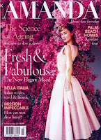
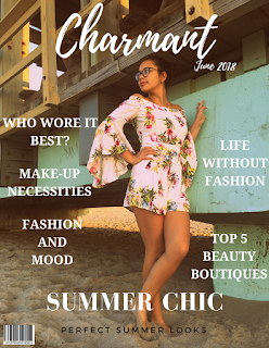
I have finally started working on the cover page on Canva. I have been having difficulty in organizing the subtexts on the side of the cover page. Based on the fashion magazines on google, they were all on one font with different sizes with three different colors. I don't really know what to do because the background I chose for the cover page doesn't allow me to have a wide color scheme. The only color that is visible on display is White. Black and Turquoise can also be seen but only on certain parts on the background photo but it doesn't seem to blend very well.
My cousin and I have been finding alternatives so that the color scheme will blend well, but so far we have no solution. I am starting to get really stressed. I feel like I'm running behind with this project since it's due in like three weeks and I have only been working on just the cover page and I still have to work on the table of contents and the two page spread. It turns out that the the inspiration cover page I mentioned earlier in my blog is not going as planned, I've had to make lots of changes throughout the weeks. The more I work on the magazine, the more it goes in various directions.
My cousin and I have been finding alternatives so that the color scheme will blend well, but so far we have no solution. I am starting to get really stressed. I feel like I'm running behind with this project since it's due in like three weeks and I have only been working on just the cover page and I still have to work on the table of contents and the two page spread. It turns out that the the inspiration cover page I mentioned earlier in my blog is not going as planned, I've had to make lots of changes throughout the weeks. The more I work on the magazine, the more it goes in various directions.


Comments
Post a Comment